⋱ Two Fixed Rate Loans in a Week
[Bubble Chart]: R, Adobe Illustrator, API
The Story
Fixed-rate leveraged loans are rare - like 1 in 800 rare.
Then suddenly, as my editor Jack described in his feature article, they were like London buses - two fixed-rate TLBs came along at once in early February 2025.
And they weren’t from nobodies. In fact, one was issued by the company of the richest man in the world.
░ The full story is available to subscribers of Bond Radar, a London-based financial news & data company - 28 Feb 2025
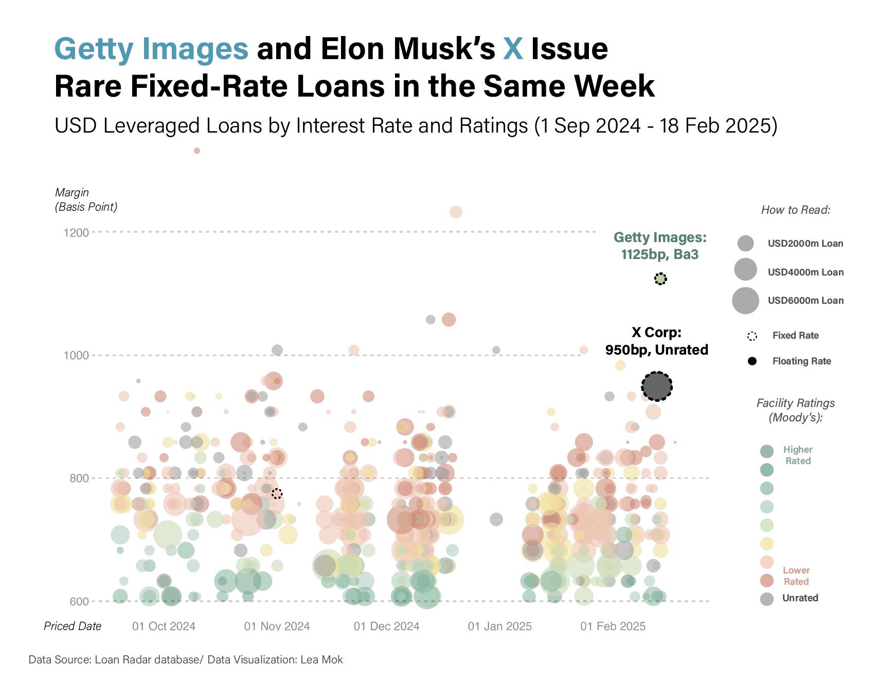
The Graph
These two loan deals aren’t just rare - they’re also expensive for the borrowers.
To show just how costly they are, I created this bubble chart of all leveraged loans (loans issued by sub-investment-grade borrowers, essentially, companies that are not very “credible”) priced between September 2024 and mid-February 2025. The bubble size represents loan amounts in dollars, while the colour reflects the credit rating assigned by Moody’s. I also factored in the SOFR base rate (437 basis points as of 18 Feb 2025) for floating-rate loans and compared them with fixed-rate ones.
As the graph shows, even though X Corp (formerly Twitter) is a relatively large company and Getty Images’ loan has a significantly higher credit rating (which is in green) than most others, which are in red or yellow, both are paying exceptionally high interest rates to borrow money.
There are various reasons for this. Bloomberg has a great article explaining how JPMorgan structured Getty Images’ loan to resemble a high-yield bond.
As for X, its previously unsellable debt gained traction after Donald Trump was elected president, with Elon Musk calling himself Trump’s “first buddy.”
| Data Source | Bond Radar API |
| Tools used | Rstudio, Adobe Illustrator |